Somebody find the cable!
The music plays,
And the dancers parade.
Somebody find the cord!
Images, not stills, flow
In epic interaction,
Intimate satisfaction.
Somebody find the program!
Let me download
What plays in overload.
It flickers like a candle,
Drips drops on the page;
It’s coaxed with thousands of words,
Hoping to evoke a host of emotions.
Hand down the rope,
Help me swim and float
Until the telling
Is done.
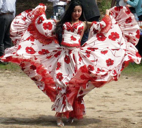
Character Origins: Ocha

Ocha enters the stage unnamed on page 66 of the epic spy-thriller saga Gypsy Spy: The Cold War Files. She is the soothing angel of mercy calming Carlos after a fitful nightmare. Her first words to him are heartfelt, but wide of the mark.
“You’re safe now,” she said.
I have shared sketches of her before, which you can read about here. But where did she come from? Like any good character with real flesh and bone, her seeds were sown in the soil of real life.
The first chase sticks with you. I knew boys growing up who suffered through the cootie phase of childhood, that time in life when the opposite sex is scary, dangerously different, and carries of unknown pathogens best avoided. They suffered. I chased.
Charlie Brown had the Little Red-Hair Girl. For me, it was Rosa Agost, an ash-blond Spanish girl with a substantial infusion of the Swiss in her bloodline. We never sat in class together because the grade school I attended in Castellón de la Plana was segregated. The girls had their own side and the nuns. The boys had the maestros with the heavy hands and serious brows.
Getting near the girls during recess required boldness, creativity, and a certain level of recklessness. The heavy-handed men who taught the boys were once boys themselves. Our machinations seldom, if ever, fooled them. Kick the soccer ball hard enough on the playground and it might land on the girls’ side. Someone has to get it, right? Why play by the school yard wall when the middle ground offered such a better view? Stay on your side, boys, or meet the hand!
Rosa captured my attention when I was seven. Maybe it was the hair. Or the smile. Or the eyes. I chased. She ran. Sometimes we all ran and she watched. Her method of choosing the lucky one to be designated her boyfriend was to throw her sandal as far as she could. The boys had to race for it, to the victor the spoils of the coveted title of her novio.
Rosa was her given name, but she went by Ocha, the feminine form of the Spanish word for eight. Not only was she born on August 8th, her surname was Agost, one vowel shy of the Spanish name for August.
Children of the mind, the characters that populate the stories of writers, are chimeras of those we meet and observe in life. We capture the qualities that captured us—the smooth lines and the odd angles, the tangled emotions and sincere feelings, the triumphs and the tragedies—and cob them together into someone else, fictional but true.
When we run out of time, because writing is never finished, we stamp our disclaimer under the copyright:
This is a work of fiction. Names, characters, places, and incidents either are the product of the author’s imagination or are used fictitiously, and any resemblance to actual persons, living or dead, business establishments, events, or locales is entirely coincidental.
Yep, entirely coincidental. Happy birthday, Ocha!
Almost there!
How about it writers? Ever been there?
Internal Dialogue – Roman or Italics?

I am a font freak and a typeset tyrant. This penchant bled into me from my earliest years. My father was a printer. I am a printer’s son. Dad always had a magnifying loop in his pocket. Reading the morning paper for him was more than just getting the news. He admired the layout and examined with his loop the mix of dots that made the pictures. His trade and passion informed me that writing was as much a visual art as it was a literary one.
A painting is more than splashes of color on canvas. The artists’ choices of media—oil vs. watercolor, sponge vs. brush, heavy stroke vs. light touch—influence how their inner vision comes out to the world. In similar fashion, writing is more than splashes of words on paper. Poetry was my main form of creative writing when I was young. Working out the centering of my text on a fresh sheet of paper rolled into my typewriter was as much a part of the poetry as the stanzas themselves, particularly if I chose to break from the convention of left aligned text for visual subtext to the lines of rhyme.
I like rules. They serve readers and help to keep us on the same page. Standard formatting options takes the guess work out for readers. They come to our work with a trust in the rules. A period ends a sentence. An indent indicates a new paragraph. Quotation marks show dialogue. The rules allow them to hear our voice much like a musician following the composer’s notes across the staves can hear the music. This understanding brings me to the subject at hand, internal dialogue.
Internal dialogue can serve many functions in our fiction, such as:[1]
- Establishing your characters and their uniqueness.
- Revealing things below the surface: pains, secrets, hope, fears …
- Creating and developing suspense.
- Revealing character motivation.
- Rendering reflection.
Two main conventions used to prevail for internal dialogue in fiction and they each had their particular function and strength. The first is straightforward and easily understood. For instance, the point-of-view character is at a rendezvous waiting for her paramour. It is nearly an hour past their meeting time and he hasn’t shown. Wherever could he be, she thought.
This method mirrors regular dialogue in that it uses “he/she thought” much as we use “he/she said” in regular dialogue. “Terrible traffic, dear,” he said. “Sorry I’m late.” (I know. I just let all the tension out of the scene. But wait, internal dialogue can save us yet.)
Traffic, on a Thursday afternoon? Not likely. What has he been up to? “I was beginning to worry about you,” she said.
Using italics for internal dialogue is the second main convention that used to be in favor. It has the benefit of allowing us to discard the “she thought” attribution while at the same time signaling to the reader that they are seeing something different and important. If the convention is understood and accepted, the reader moves seamlessly from the narrator’s voice to inside the characters head.
As I mentioned above, I like rules. Following them exhibits a certain level of professionalism and avoids unnecessary confusion for the reader. I recently shared some of my work in progress with a local writer’s critique group. The piece had a snippet of internal dialogue in italics. Note the critic’s comment.

Italics? Okay, I thought (no pun intended) the rule was to write in italics any internal dialogue that didn’t have an attribution. The critique group begged to differ. I like the convention for the reasons listed above. Leaving internal dialogue in roman type without attribution gives no aid to the reader, forcing her to figure out its source based on context. What is a writer to do?
Well, this writer turned to a trusted resource, Writer’s Digest. I got doses of Writer’s Digest with my mother’s milk, so they should know, right? Barnes & Noble, here I come! Browsing the shelves of that beloved store, I found the following beauty.

A guide to thinking in fiction was just what the doctor ordered. Sadly, only one chapter dealt specifically with this topic. Its author, Elizabeth Sims, had this to say about the format of internal dialogue:
“As for format, the only rule is to avoid quotation marks, single or double, as they’re associated with spoken-aloud dialogue and confuse the reader. It used to be the convention to put inner thoughts in italics … Now the trend seems to be to keep everything in roman text, the idea being that italics are intrusive and unnecessary.”[2]
I would describe italics for inner thoughts as alertive, not intrusive. The slight mental jarring brought about through a change of type puts the reader on alert that they are hearing directly from the character’s mind. What do you think? Writers and readers, give a writer a helping hand. Let me know in the comments your thoughts on the subject and your preference. It may save me hours of formatting later and future readers will thank you.
[1] “Understanding Internal Dialogue” by Elizabeth Sims, Crafting Dynamic Dialogue: The Complete Guide to Speaking, Conversing, Arguing, and Thinking in Fiction, The Editors of Writer’s Digest, Writer’s Digest Books, Cincinnati, 2016, p. 254-255.
[2] Ibid., p. 255.
Creative Motivation in Teaser Trailers

Writers, have you ever dreamt of seeing your book turned into a movie? For me, building book trailers is a way of getting a taste of that dream. Though used primarily as a marketing tool, book trailers can provide much more for the author and his or her fans.
As a writer, crafting a book trailer stokes my creative fires. When frustrated or challenged in the composition process, providing Gypsy Spy fans—both present and future—with the thank you of a visual treat of a book they spend time and money on keeps me going.
This trailer is for my next novel in the Gypsy Spy saga, Valley of Wolves. The novel itself is still a work in progress. The trailer is as much a teaser for its future audience as it is a prompter for me to keep going to finish line.
Historical Fiction, Thy Name Is Fun

I am a child of the Cold War. My father actually settled on the spelling of my first name, Nikolas with a “k,” not a “c” or a “ch,” when he saw the spelling of Nikita Khrushchev’s name. My father was far from being a Soviet fan, but he was eclectic in his tastes and felt the “k” gave the name a uniqueness.
When I set about penning Gypsy Spy: The Cold War Files, it was a contemporary espionage thriller with some historical flashbacks. But life happened along the way and the story was buried for more than twenty years. When I pulled the project back out and rewrote it, I recognized it as a period piece, but never thought of it as historical fiction.
When one dreams of publishing a book, one seldom thinks about the actual marketing that will need to be done for readers to find it. Most authors I know write for the love of writing, not for the opportunity of putting together and executing a marketing campaign or business plan. But the truth of publishing, either traditionally or as an independent, is that it is a business. If one is serious about it, one will have to go to market. Thankfully, I live in the Hampton Roads region of Virginia, an area with strong support for the independent authors.
Soon after publishing, I was able to line up signing engagements at local libraries. These libraries typically have a collection of books from local authors they display separately. [Click here to check out this fun video I did about my inclusion in the Virginia Beach Public Library.] All they ask is that you donate your book so they can vet it for quality before they include it in their catalog. It was as a result of this that I got my first glimmer of the fact that I had published a piece of historical fiction.
Below is a snapshot of the book’s information in the online catalog for the Chesapeake Public Library.
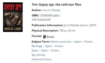
Historical fiction, who would have thought! Though I have always admired historical fiction writers—James Clavell and Ken Follett come to mind—it wasn’t a type of writing I ever thought I could do. After all, it requires extensive research, attention to detail in order to avoid anachronisms, and a compelling story. Compelling story I felt I could pull off, but the rest? The rest happen to be things I actually enjoy.
Enter The Valley of Wolves, my next novel in my Gypsy Spy series. What I had envisioned as a contemporary espionage thriller has grown into a historical fiction spy thriller epic. Over the past year, I have been devouring history books and newspaper archives in preparation for writing about what happens to Carlos de Leon—a.k.a. Rat-gêló, a.k.a. Gavin Leoppard, a.k.a. you’ll have to wait and see—next. I have found writing in a historical context to be inspiring and much more fun than I expected.
America’s war with Communism began shortly after World War 1. President Woodrow Wilson actually sent ground troops into Russia to help the White Russians in their civil war against the Red Russians. We didn’t return to an earnest struggle against them until the conclusion of World War 2. These are the roots of the Cold War.
In my research of the Gypsy experience during the Nazi terror, I have been following the trail of the Reich’s policy of genocide toward the Roma. This research turned into a Photoshop project. The names and sentiment are historically accurate. This edict will be one of the chapter epigrams in Valley of Wolves.
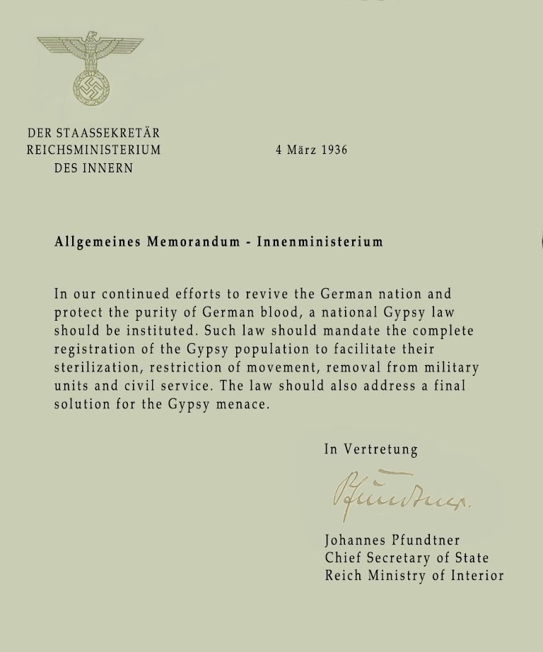
I could not find the actual verbiage of the memo from Pfundtner, only what it pertained to. His memo became one of the corner stones that led to the incarceration and industrial murder of Roma under the Reich.
I chose Book Antiqua as the font because it came closest to mirroring the typeface of Nazi Germany documents. The layout is consistent with declarations from the regime. The Nazi eagle and Pfundtner’s signature were found through Google image searches of documents of the era (public domain images). I assembled the components in Photoshop. I used the eyedropper tool to match the paper color with the background in the eagle emblem. Using the brush tool, I cleaned up around the signature to make it appear as a natural part of the document.
Marketing your work involves many aspects in today’s publishing landscape. Our age demands an online presence, and to be present in social media in this day and age requires us to be visual. Pictures and videos are a must. Thankfully, there are powerful tools available even to novices such as myself that can render near professional results. One also gets the benefit of enhanced creativity, always a plus for any writer.
The Hook

I gravitate toward the long form. When people ask me where I’m from, I ask them if they want the short story (I was born in California) or the long story (I didn’t grow up there). I find the long story to be much more informative and entertaining. I stink at short stories and am amazed at the skill of those who can pull them off.
Gypsy Spy is an epic espionage thriller composed of three novel-sized acts. I didn’t set out chasing a word length, I simply wanted to tell the story. When it was done, I was left with a work that was destined for independent publishing as the traditional market wouldn’t touch my word count with a ten-foot pole. It could certainly be cut back a bit—after all, what work couldn’t use a little more editing—but to get it to traditional length would require as substantial loss of story or the breaking apart of the acts. Neither option was attractive to me.
I recently attended a prominent writer’s conference. One of the greatest opportunities offered at serious writer’s conferences is the chance to actually pitch your work to agents and editors. Traditionally published and independent authors both have to pitch and market their work if they have any hope of ever selling a book. The difference between them is that the independent doesn’t have to go through the entire process of putting a proposal together, sending out query letters, and having a one-sheet. Frankly, until I was preparing for the conference, I had never heard about a one-sheet.
Think of the one-sheet as the resume for yourself and the work you are presenting, the short story version of who you are and what you wrote. As if boiling down your life and art to a one page synopsis wasn’t daunting enough, experts suggest that it is essential for your one-sheet (and for your marketing efforts in general) to write a hook for your novel.
The hook for a novel is analogous to the tagline for a movie. It is meant to encapsulate the theme and essence of the story while at the same time drawing the reader in. Tagline’s are great, a bit of marketing genius that challenges even Twitter’s brevity. As brilliant as Alfred Hitchcock was, his star doesn’t outshine the cleverness of the ad men.
Psycho “Check in. Relax. Take a shower.”
The Birds “… the next scream you hear may be your own.”
Ridley Scott’s team took a riff from The Birds tagline to promote perhaps the most intense science fiction horror film of all time, Alien. “In space, no one can hear you scream.”
Taglines run the gambit from straight promotional (“greatest film ever”) to funny. The tagline for Shrek was “The greatest fairy tale never told.” A funny tagline for a hilarious movie. The movie The Men Who Stare at Goats was also funny, but in a different way. And unlike Shrek, it had a basis in actual government research programs. Even so, its tagline is classic humor: “No goats, no glory.”
Dramatic films have their taglines as well. The tagline for the film Memento is effective because of its intrinsic contradiction: “Some memories are best forgotten.” The tagline for The Prestige encapsulates the entire essence of the film: “Are you watching closely?” If you haven’t written a hook for your novel, I trust these examples from the movie industry have given you some good ideas.
When I was composing my one sheet, I had just come off an intense, near 12-hour shift at the day job to finalize my preparations for the conference—not the best circumstances for creativity. Writing a hook seemed an impossible task. How was I to take a 280,000 word novel and boil it down to a sentence? It took some doing, but by the grace of God I was able to get it done in six words.
“One orphaned Gypsy against two Superpowers.”
If you have a favorite tagline or have a hook for your novel, please share it in the comments.
Meme Monday – Plotting

I have been wrestling for weeks over a particular plot point in Valley of Wolves, the next Gypsy Spy novel. Finally, after much contemplation, it fell into place and subsequently provided support for other parts of the intended narrative. I was excited enough to do a little celebration jig and build a meme on the experience.
While Valley of Wolves is under construction, dive into the Gypsy Spy epic here.
Meme Monday – License to Edit


Let’s face it, all work needs editing even visual work. I used this concept a while back in the post “A Meme with no President.” Adobe Creative Cloud still challenges me, but I am getting more comfortable in it. The original meme was built using MS Publisher. This one I did in Photoshop. I think it’s better. Compare the two and let me know what you think.
